(Big, big shout-out to the Open Elections Project)
Once the data is in working order, keep an eye out for some thoughts on PA in 2018. But in the meantime, I thought I would present a sequence of maps that made me laugh out loud, and reinforce some basic rules about maps and data. (I am not the first to come up with these, but PA makes them *super* striking).
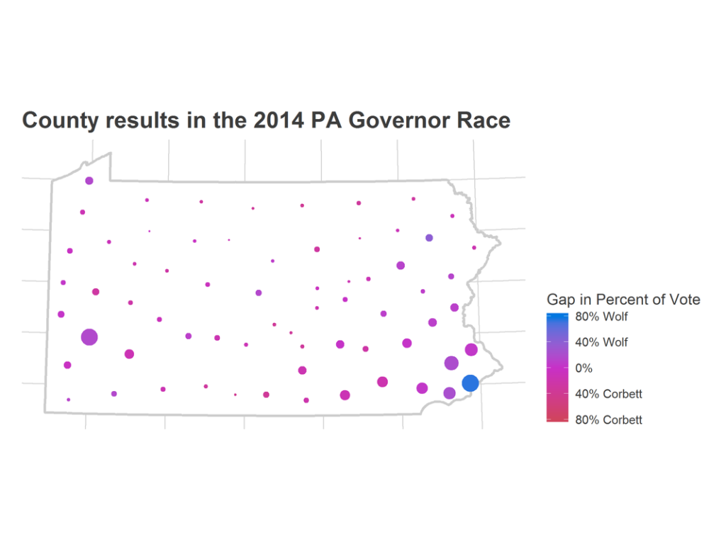
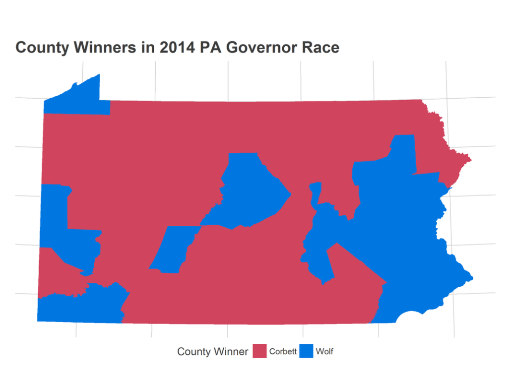
How did Pennsylvania vote in the 2014 Gubernatorial Election? Democrat Tom Wolf beat Republican incumbent Tom Corbett by 1.92 M votes (55%) to 1.57 M (45%). However, Corbett won 43 counties, to Wolf’s 24.
A naïve map of the election, coloring counties by winner, makes the election look outstanding for Corbett.
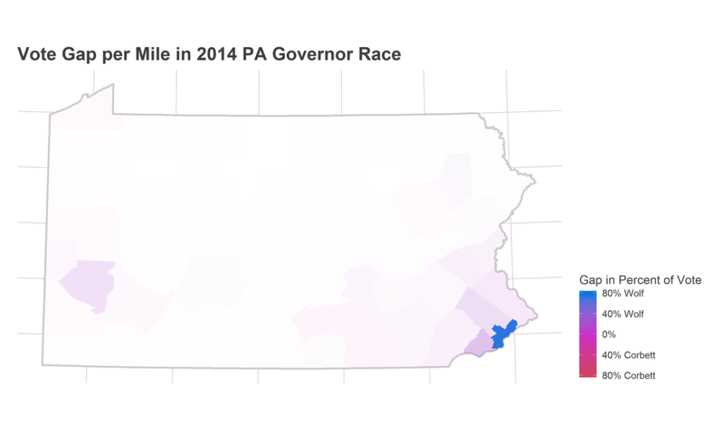
This map isn’t perfect either. It shows us how the land-area of Pennsylvania voted, but land doesn’t vote. People do. Some of these pixels represent many fewer voters than others. If we now change the transparency of the colors to represent the voters per mile, we get a map that in which the strength of the color is proportional to the number of votes the pixel represents.
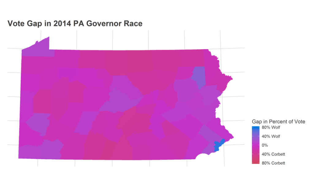
There is another method to correctly represent counties’ vote total. That is to ignore the polygons all together, and represent counties by dots at their centroid, scaled by the number of votes.